Prices & Value
The FoodMenu Price Index, Explained
How we compare the same restaurant product across eleven countries, what the numbers mean, and the four things a dollar price can never tell you.
5 min read · 1,084 words
What food actually costs, where it costs least, and why the gap is so wide.
The same burger can cost three times more across a single ocean. This hub is the editorial half of our global price index: the currency maths, the wage-adjusted comparisons, the combo arithmetic that decides whether a meal deal is a deal, and the reasons a market prices the way it does.
How we compare the same restaurant product across eleven countries, what the numbers mean, and the four things a dollar price can never tell you.

Where the same branded burger, coffee and pizza cost least across the fourteen markets we track - And why the ranking is not the one most people expect.

Britain tops our price table for identical branded products, ahead of Singapore and Ireland. Here is what is actually driving the gap, and how much of it is a labelling illusion.

Rent, wages, tax, tariffs, brand positioning and franchise structure all land on the menu board as one number. Here is how to read which is which.

Combos are the most profitable thing on a menu board and the arithmetic is deliberately hard to do standing up. Four checks that take ten seconds each.

Menu prices have risen faster than general inflation across most developed markets. The reasons are structural, and they show up clearly in what chains have done to their value ranges.
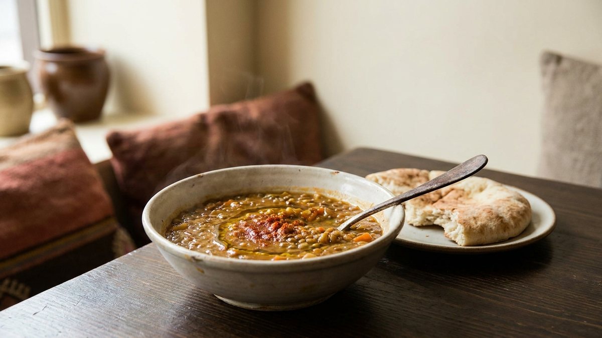
The lowest published prices across all 255 menus in our database, market by market - And why the answer is almost never a burger.

Every chain runs a value range and none of them make much money on it. What it is for, why it keeps shrinking, and how to tell a real one from a decoy.
Price reports are signed, reviewed by a person, and earn points when accepted - So they need an account. Signing in takes one tap and brings you straight back to the report.
Continue with GoogleYour email is never published. How reports work.